Well, not just the thumb really, but I'm very much grateful for my hands for they harmoniously love working together. Not another Thumbelina nor Tom Thumb, but this re-illustrated book celebrates the value of working together using fingers as figurative model. I think, Si Hinlalaki (The Thumb), illustrated by Hubert S. Fucio and story by Virgilio S. Almario, is one of the best illustrated local children's books today.
Although, I just wish the illustrator pushed the envelope more in the cover illustration since he has already showed so much creativity inside the spread illustrations. Yes, I know the color, composition, and typography is very attractive. Maybe I'm just too fond of covers with so much details and action scenes that spark interest about the story more than a character mugshot. When I first saw the book in the store, the cover didn't got me that excited only until later when I opened it. To my surprise, the illustrations are excellently drawn. YES, I can hear you, so let's say it altogether now: never judge a book by its cover.
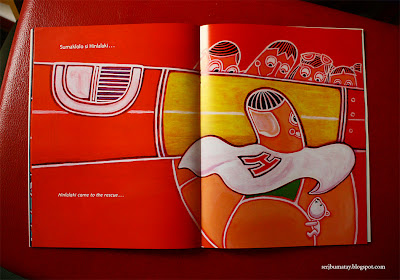
Where else has the illustrator drawn inspiration for the style but within the segments or the lines of the palm. For me it's very effective because the segmented style exudes a graphic touch and may connote demarcation, a border, or in a deeper sense - symbolizes the selfish ego. The visuals pretty sum up or foreshadow the moral of the story which is about [edited].
I thought illustrating within the setting of the hand could be repetitive and boring because you couldn't illustrate beyond that, but the illustrator has creatively solved this challenge by showing unpredictable scenes and rendering. Using white as outline instead of the usual black marker makes it current, more striking, and playful, yet at the same time looks timeless.
"Because he was small, and had a different shape, he was called an outsider." This is my favorite illustration because the visual interpretation of this text is both literal and has reference to the story of the Three Little Pigs. Clever but risky because while it tries to break the idea of uniqueness as outsider in a funny way, I pity the wolf for being an overrated symbol for slyness (haha) and on another view may also be misconstrued that an "outsider" is a bad person.
This is the best composition of the illustration for me because of its simple but persuasive graphicness, almost poster-like, reminds me of the bold and stark Russian propaganda posters.
Another surprising detail, each line is hand drawn! As an illustrator, I know how difficult it is to render straight lines using the plain old brush. That diligence and opting for traditional media is admirable for an illustrator when he can render the same using vectors at the minimal time (Note: digital art does NOT necessarily mean simple to make, but it does saves time).
Thumbs up if you agree with me.


No comments:
Post a Comment