Saturday, November 23, 2024

Wild Things, Children's Book Illustration, and Spoiler Alert at the Art of Maurice Sendak Exhibit

A small banner of a familiar character from a children's book caught my eye while riding on a bus on the way to work in downtown Denver. It was Max, the king of the wild things in the legendary children's book author and illustrator Maurice Sendak's most beloved book, Where the Wild Things Are.


Max and the wild things hanging out at the Denver Art Museum bridge way billboard along 13th avenue in downtown Denver.

I learned through a good friend from the other side of the world that there's currently an art exhibit of his body of work at the Denver Art Museum.

Was this another calling (like creative clues per Rick Rubin in The Creative Act) to remind me of my most fabulously productive, past illustration and art career decade of my life? Or did the memories of my most revered mentor, illustrator, and the real father of Philippine children's literature, the late Ruben De Jesus nudged me to move forward and stay active on this calling? Just like the moth that followed me in the bus all the way at home when he passed away, always reminding me of what I could become and of being...at home.

Bought my ticket and looked forward to having an wholesome date with my artiste-cultured self, after a very long time. I bared any expectations, thoughts and feelings, and distracted myself of full busy work after a holiday that day in preparation of this love-myself-making ritual and pro-creative endeavor.


Fantabulous exhibit opener, gotta give credit.

One of the unexpected things I saw in the exhibit is that most of Sendak's works were so tiny for my adult, transitioning-to-senior years eye vision. I think the artwork sizes were economically efficient for an author-illustrator who was very productive in his entire six decades career, something to consider in my economical state of studio-work-bed small space.


Final art for A Hole Is to Dig, Maurice Sendak's first successful book, photo above for scale.


I adore his one-page fantasy scene drawings, like wild AF! (see photo above)
And the very considerate ticket reservation Museum attendant who transferred me to an earlier slot.


My favorite part of the show: photo reference (top) for the book, Higglety Pigglety Pop! and final artwork (above).

I found the exhibit to be undecided to whom its audience really is for: is the exhibit for kids of now or is it for his kid fans (who even ate his mail!) who loved the book or Sendak and have grown up but remained kids at heart? Capturing a broader audience is a problem. I came...to this observation because most of the eye level of the artworks were considered for adults' sizes-ehem-heights, although the encased actual books and some of the artworks were lower than my eye view which were meant for kids (but why encased-a reproduction would supplement-so kids could freely browse and see the connection with the artworks), which became even harder to view and enjoy with the poor lighting as adult (I know it's to protect the works but the place is really dark at night). But then a surprise, *spoiler alert* a nude male photograph (by another artist, as reference) in its full artistic glory!


Case in point (photo above): I doubt if the top artworks can be easily viewed by kids, they're above my eye level; the encased books below are too low to see by an average height adult like me (5'8). Also take note of the dark pathway on the left, it's like finding your way into a dark alley in a cinema.

Although Sendak's works and books didn't really shy away from nudity and controversy, as some of his most controversial children's books contained nudity and double meanings. I precisely understood nudity as innocence in his works. In the wake of Christo-conservatives taking over the U. S., it's a brave move to openly invite discussions on body issues and sexuality. From a gay children's book author-illustrator's body of work exhibition. In a blue majority state where half is still conservative. But in the bed of propagandas where the dirtiest wins, whose side really are the Wild Things?


"To ban or not to ban:" final art (above)  for In the Night Kitchen, watercolor on paper with ink on Mylar overlay.


Studies for Penthesilea, watercolor and pencil on paper. His consistent illustration style prevailed even in illustrating books for adults. He mentioned in an interview that he wasn't really fond of one consistent style, as having more styles can provide more exciting creative opportunities.

Was the inclusion of a nude photograph a ploy to create provocation around the exhibit and perhaps invite more intrigued patrons? Literally like what this blog and wannabe influencers like me are doing? The ticket availability when I booked seem to be just the ordinary day average group size, surprisingly, for a major celebrated artist exhibit like Sendak and it was even a Free Day (almost, still had to pay $15), compared to Frida Kahlo's blockbuster reservation (for months!) when I visited. When I shared this exhibit experience with creative colleagues, they don't seem to be familiar with Maurice Sendak's name until I mentioned "Where the Wild Things Are" title of his book. Maybe he isn't that popular with today's generation anymore, easily forgotten or drowned with so much internet hate and noise.


Maurice Sendak, his dog, and studio, memorialized.

The exhibit will be filed as my aspirational reminder to also have my own body...of work to be positively remembered as a household name, ambitiously it may worldwide, even in the small world of children's literature. That would be happy endings, memorialized.

Sunday, December 24, 2023

Bum Tiyaya Bum...It Happened

animated cover of Bum Tiyaya Bum

Our gift to you: Bum Tiyaya Bum (cover repurposed for holiday greeting virtual card by Tahanan) published by Tahanan Books, Filipino nursery rhymes and verses curated by Rene Villlanueva and translated in English by Angela Narciso Torres

And just like that, after more than a decade in the making – one of the highlights of my children's book career happened.
Bum Tiyaya Bum finally was born this year!

Happy Holidays and cheers to a more creative 2024!

Friday, November 18, 2022

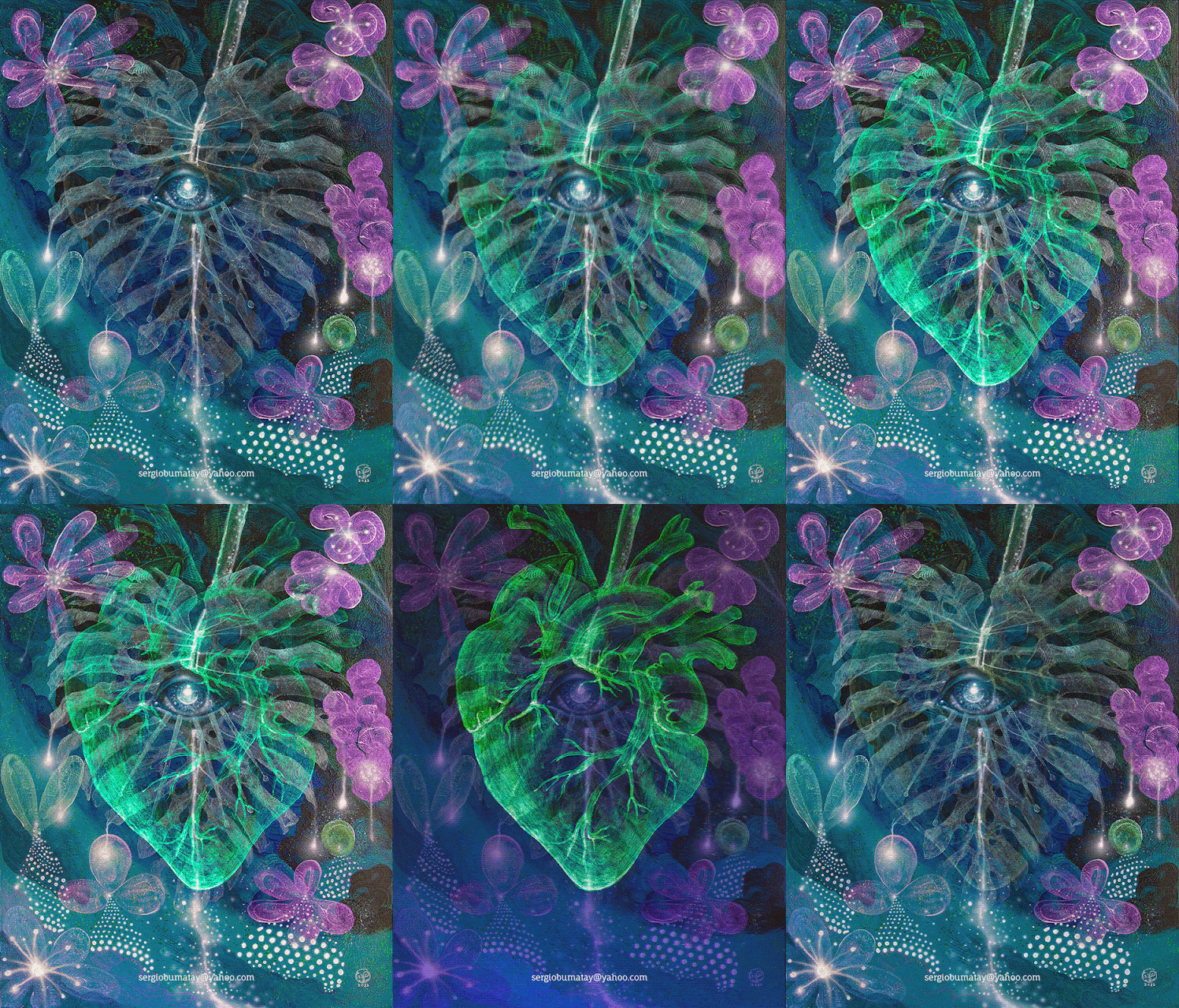
Monstera Deliciosa


Monstera Deliciosa (A Refuge in our Inner Paradise)
30" x 40"
acrylic, phosphorescent paint (strontium aluminate, europium, dysprosium), 
reflective powder, iridescent paint, interference paint on canvas
2022, Colorado USA


A new painting, it's alive yay!

A live breathing devilish monster (because it has one eye and occult-ish, beware! LOL)


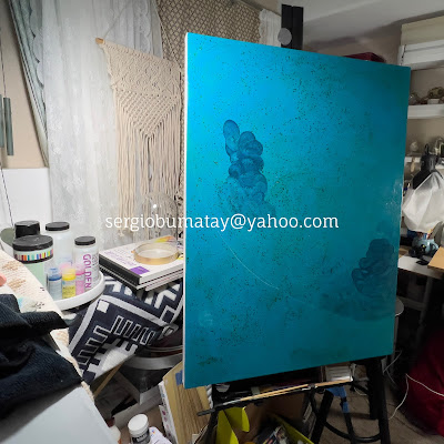
Building up textures and forms, 
I usually don't know what final form to expect nor what theme to paint.


Kidding aside, my painting is really about being in the moment; drawing calmness and power through our inner sanctuary.

I do love my day job, but it can be very stressful sometimes. Colleagues often tell me I have a cool (meaning calm) exterior, little do they know that at work–I'm always dying in nervousness inside. I'm not Marvel's Hulk, but I try to be calm by believing things will turn out to be awesome.


Monstera Deliciosa painting in progress timelapse


This is my first painting using the airbrush technique. It's another level of hand skill to master, I had to use both of my hands to stabilize the spray. Not really expecting to be an expert, but it will do for some of the elements of my painting for now.


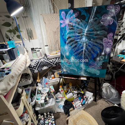
art studio, work room, bedroom all-in-one!


I also decided to include the painting as an animated digital version (gif form) for my workplace's virtual arts and culture exhibit featuring the equity, diversity, and inclusion collective efforts of the department entitled, "All Are Welcome Here" coming up in December.


Monstera in situ, trying to capture all the shimmering lighting effects


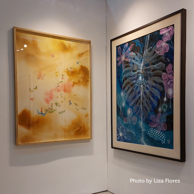
Monstera at the Philippine exhibit, alongside monster illustrator Aldy Aguirre's watercolor artwork. Photo taken by one of my good friends who also creates deliciosa works, Liza Flores


The physical Monstera Deliciosa painting is part of CANVAS' 2022 Art for Development Show, "Kasalakuyan"
November 18-25, 2022 at the UP College of Fine Arts Galleries, Quezon City, Philippines


Friday, August 19, 2022

Burnt with Pride


A package arrived from the mail brought a little surprise today. It’s the medal and exhibition catalogue for being shortlisted at the Sharjah Exhibition for Children’s Book Illustrations in the Sharjah Children's Reading Festival in UAE. The festival is one of the largest, well-funded, and prestigious book and illustration mecca in the world.


Burnt receiving their Oscar, ehem, medal for best actor in a picturebook posing role.
 

Burnt being proud of their spread in the 2022 Sharjah Exhibition for Children's Book Illustration catalogue, featuring their story, "Pink and Blue."

 
No matter how the digital medium is increasingly being popular as well as becoming as an essential, I still believe that festivals and exhibition venues for physical books are still relevant and important as ever because it showcases the latest innovation and vision in the art of picturebook illustration. Competitions bring out the best in talents, raising quality standards, super win for the kids.


Pink and Blue, fired ceramic clay, found objects, set and lighting design, photography


Pink and Blue vignette (concept by yours truly)

Pink is Blue’s big little sister.
Blue is Pink’s blind baby brother.
Pink (who takes photos of Blue) couldn’t understand Blue from the outside, but she imagines him to be enjoying the world around him.
Blue couldn’t understand Pink, but he loves playing with his sister, who guides him.
Adventure awaits for the sibling’s unconventional view of the world around them.


I tried to create inanimate objects look like they're alive and moving using photography and stop motion animation techniques.


However, the downside in competitions and showcases could be the development of an homogenized style, predictably-narrowed-subjective preferences of gatekeepers, and repetition leading to the point of dullness. It’s like the Pixar “look” dominating the animated film "aesthetic," wondering whether all the other films are sequels because they have the same look and formula. This uniformity could hamper our children’s views about diversity and inclusivity when they see it around them. Aspiring illustrators vying for recognition and attention emulate the current trending style instead of pursuing their own unique vision, voice, and creativity.


The Sharjah Exhibition for Children's Book Illustrations catalogue is a print dream: full color on a gorgeous choice of paper, filled with the latest children's book illustrators' best works from all over the world.


One of my favorite works in the catalogue: Sonja Danowski, whom I met at the Sharjah Children's Reading Festival a few years back when they were one of the top winners. Their work has evolved to a more bright and colorful palette but with the same unique strokes of brush or pen.


Another favorite from the catalogue: Kyoung-Mi Ahn from South Korea. Their work exudes a numinous atmosphere making most of the medium and monochromatic palette. 

The luxurious box that came with the medal and the catalogue which tells very loudly: they're very serious about children's literacy!


The children's lit illustration community has solved the problems of structure and limitations of media in creating a dynamic picturebook composition, characterization, illustrative content. Now let’s explore more of other unique styles, representation, views, and media.


Saturday, November 6, 2021

Fall Call: Ceramic Ball Jointed Doll Characters


Burnt Scene 1 at the Cornucopia Fantasy Drops, check it out here

I’ve been dreaming to have my own ceramic pottery (and art and so many things in general) studio. Unfortunately, a ceramic pottery studio requires a lot of space and safety precautions. Those two things are impossible to have for now. Luckily, while things were getting back to "normal" last summer, I attended a sculpture ceramic pottery workshop at the Aurora Bicentennial Art Center. The sculpture ceramic pottery workshop got me back on track with my sculpting skills. It also rekindled my interest for ceramic pottery. The center has all what a ceramic potter wannabe like me dreams of: organized studio space, all the tools and resources, and kilns! My instructor was very knowledgeable and accommodating, I learned a lot from him.


The glaze swatches at the Aurora Bicentennial Art Center looks delicious.


I couldn’t think what to make for the ceramic pottery workshop. But something has led me to be more curious about ball jointed dolls. I may have been too late for the ball jointed doll craze a few years back. However, the craft gave me the light–it’s one of the perfect medium to realize my ideas. It merges what I have been doing for the past decade and what I’d like to do next.


The ceramic ball jointed doll character ready for bisque firing.


I’ve read several ball jointed doll resources and found out that ceramic or earth clay isn’t the best medium for it. But I’m always open to try new things and know more about the craft and the medium, so I went ahead anyway.


 Ceramic ball jointed doll character pieces painted with underglaze matte and cone 10 glazes. Although I used the swatches as color references, I anticipated changes in the color outcome.


My first attempt to create a ceramic ball jointed doll characters wasn't smooth sailing. First, one of the figures, which I called “Inc,” has one of its legs and wing broke even before bisque firing. Then, the glazing colors weren’t I expected them to be due to my misstep in mixing glaze thoroughly. A certain degree of unpredictability in ceramic pottery sets hopes not too high, so I was nervous how it would turn out. 


Inc's leg broke off so I had to "glue" them with a glaze.


Burnt was burnt after firing this glaze, eye-makeup inspired from Mad Max: Fury Road's Furiosa


Tooth was the only ceramic ball jointed doll character that was baked and colored just right after coating this glaze.


The frustration didn’t stop there, stringing the parts together is another problem. The pieces were so heavy that wiring needs careful planning. I ended up not using every part to reduce weight and give it a bit of exaggerated proportion than what I intended.

Overall, I’m still satisfied when I saw my baked ceramic ball jointed doll characters come to life.

Follow the three character's adventures and get Tooth and Inc's art prints at Cornucopia here.


Watch behind the scenes string struggles:


top artist, top talent, trending art, best art, cool art, illustration, unique gifts, best gifts, doll gift, doll collector, doll collection, unique dolls, doll decor, print, holiday gift, decor, home decor, best home holiday decor, holiday decor, fall season, fall decor, christmas holiday shopping, christmas gifts for love one, christmas decor, unique christmas gifts, corporate gifts, corporate holiday gifts, corporate display, interior decor, corporate collection, art collection, art collector, art decor, art investment, investment, best collection, investing in art, NFT products, NFT art, NFT collection, corporate investment, investment opportunities, unique investment, non fungible tokens, tokens of investment, art tokens, top artist investment, top art collection, top, best investment, how to build art collection, build wealth, building wealth opportunities, buying worthy art, buying art collection, trending gifts, interesting art, interesting gifts, interesting collection

Friday, July 9, 2021

How to Make a Successful Resume for Graphic Designers in 2021

Now that companies and economies are slowly opening after all the COVID-19 pandemic caused unemployment for millions of people, the challenge of looking for a job is even greater this 2021 because of tough competition. But you can increase your chances of getting hired on your dream job by following what I’ve learned in creating a successful resume when I was job hunting.

"The Search" acrylic on canvas, 2018

I applied to hundreds of regular full time job posts for graphic design and creative positions for almost a year and have known the tips and tricks in successfully getting your resume through potential employers. I’ve been off the job market for a while as I got jobs mostly through referrals back in my home country. Since then, the game of job hunting has changed drastically for some freelancers/independent professionals/self-employed like me.

I went through several job hunting seminars, job fairs, and job forums to every workforce centers in Colorado. I’ve even invested in improving my skills and experience. The tips I’m sharing on creating a successful resume are applicable in the US but I’m sure it also applies anywhere in the world as most companies are scaling globally. It’s not enough anymore that you have the experience and skills, you have to be smarter than what you have.


Examples of creative resumes with infographics that really look great, however they won’t cut through HR’s ATS.


I found out that most HR from employers are mostly using the Automated Tracking Systems (ATS). Update: some progressive companies may have updated to modern systems to accommodate equal opportunities. Most companies are even hiring third party HR hiring teams to handle their recruitment and onboarding processes. 

Along the way, I figured out how to outsmart the ATS system to get my dream job through writing an effective resume for a graphic designer position. After applying what I learned, my chances in getting schedules for job interviews went up to more than 85%. I’m now working full time in my dream job!
 
Here are some tips to effectively make your graphic designer resume standout and that will successfully get you at least 50% up chances of getting that important first job interview:

1. Make your resume in a simple format.

Stop making your resume look cool with some colorful design templates and samples you searched online or designed yourself. It simply doesn’t work and won’t get you a job interview from HR managers or hiring specialists. Here’s why – the ATS system wouldn’t recognize your designed resume. Savvy infographics highlighting your skills and summarizing your work experience are great in portfolios but wouldn’t even cut it through a resume ATS. Save the fancy resume in your actual interview. Instead, format using a basic type-setting app like Google docs, Mac’s Pages, or Microsoft Word. Save it per company’s required file format which are usually word, rtf, or–the one I found best for graphic designers is PDF, where the system can scan the texts but still preserving the basic layout.

2. Customize your resume to EACH job position and company you applied for.

Do not send out generic resume that you can just send out to an HR emailing list or job posting contact list. If you send a generic resume, not only that the HR manager or hiring specialist will ignore your resume, but also your resume won’t get through the automated system. Remember, your initial goal in job hunting is beating this automated system that most HRs are using, so be smart! Why do you need to fit your graphic designer resume to each job position and company you are applying? Simply because it automatically scan and tracks keywords that matches the culture of the company you are applying for. And, please don't be lazy to fill-out online applications thoroughly!

3. Don’t expect too much, yet.

I know that most of us are in desperation to look for a graphic design job in 2021 given that millions are unemployed right now and many are in the same boat of job hunting. Add the fact that the graphic design or any creative position, is a very competitive and over-saturated field ever since digital technology took off. For now, never fall in love at first sight to a single job position that you find. Here’s the thing, it’s so much better to place your eggs in multiple baskets than putting much effort to that one graphic design position that averages a hundred applicants. So increase your chances of successfully securing an interview and getting hired in your dream job by applying to several positions you’re interested in and has the most potential BUT customizing your resume to EACH position and company.

I wish you good luck in making your successful resume and finding your dream job!

The strategies above are snippets from this free, handy, easy to digest booklet (click on cover below) that details on how to beat the ATS system and successfully making your resume to standout and on top of the shortlist of an HR manager or hiring specialist, including: 
  • never-heard-before top tips, 
  • resume and cover letter samples, 
  • awesome and useful keywords, 
  • how to format your impressive resume, and
  • how to compose your cover letter. 
This free PDF also details on how to effectively edit your graphic design–or any job–resume and cover letter that greatly increases your chances of successfully getting that important first job interview to the job and company you’ve always dreamed of! Please share away this free information on creating an impressive graphic designer resume in 2021.


Disclaimer: The information and views expressed are those of the author and does not necessarily reflect the views, policies, and values of the author’s current employer.


free ebook, great resume samples, best graphic designer resume sample, effective resume, how to make a compelling resume, cool resume sample, how to write a resume, how to make best resume, how to pass interview, how to get a get job successfully, how to answer interview questions, nice resume sample, great resume, free resume sample, free tips, tips what to write in resume, tips to ace interview, tips to get dream job, remote working, working from home, flexible work schedule, flexible hours, remotely working, remote jobs, home office, home jobs, jobs at home, flexible office, flexible workplace, flexible dream job, remote office.