Showing posts with label Personal. Show all posts

Saturday, November 23, 2024

Wild Things, Children's Book Illustration, and Spoiler Alert at the Art of Maurice Sendak Exhibit

A small banner of a familiar character from a children's book caught my eye while riding on a bus on the way to work in downtown Denver. It was Max, the king of the wild things in the legendary children's book author and illustrator Maurice Sendak's most beloved book, Where the Wild Things Are.


Max and the wild things hanging out at the Denver Art Museum bridge way billboard along 13th avenue in downtown Denver.

I learned through a good friend from the other side of the world that there's currently an art exhibit of his body of work at the Denver Art Museum.

Was this another calling (like creative clues per Rick Rubin in The Creative Act) to remind me of my most fabulously productive, past illustration and art career decade of my life? Or did the memories of my most revered mentor, illustrator, and the real father of Philippine children's literature, the late Ruben De Jesus nudged me to move forward and stay active on this calling? Just like the moth that followed me in the bus all the way at home when he passed away, always reminding me of what I could become and of being...at home.

Bought my ticket and looked forward to having an wholesome date with my artiste-cultured self, after a very long time. I bared any expectations, thoughts and feelings, and distracted myself of full busy work after a holiday that day in preparation of this love-myself-making ritual and pro-creative endeavor.


Fantabulous exhibit opener, gotta give credit.

One of the unexpected things I saw in the exhibit is that most of Sendak's works were so tiny for my adult, transitioning-to-senior years eye vision. I think the artwork sizes were economically efficient for an author-illustrator who was very productive in his entire six decades career, something to consider in my economical state of studio-work-bed small space.


Final art for A Hole Is to Dig, Maurice Sendak's first successful book, photo above for scale.


I adore his one-page fantasy scene drawings, like wild AF! (see photo above)
And the very considerate ticket reservation Museum attendant who transferred me to an earlier slot.


My favorite part of the show: photo reference (top) for the book, Higglety Pigglety Pop! and final artwork (above).

I found the exhibit to be undecided to whom its audience really is for: is the exhibit for kids of now or is it for his kid fans (who even ate his mail!) who loved the book or Sendak and have grown up but remained kids at heart? Capturing a broader audience is a problem. I came...to this observation because most of the eye level of the artworks were considered for adults' sizes-ehem-heights, although the encased actual books and some of the artworks were lower than my eye view which were meant for kids (but why encased-a reproduction would supplement-so kids could freely browse and see the connection with the artworks), which became even harder to view and enjoy with the poor lighting as adult (I know it's to protect the works but the place is really dark at night). But then a surprise, *spoiler alert* a nude male photograph (by another artist, as reference) in its full artistic glory!


Case in point (photo above): I doubt if the top artworks can be easily viewed by kids, they're above my eye level; the encased books below are too low to see by an average height adult like me (5'8). Also take note of the dark pathway on the left, it's like finding your way into a dark alley in a cinema.

Although Sendak's works and books didn't really shy away from nudity and controversy, as some of his most controversial children's books contained nudity and double meanings. I precisely understood nudity as innocence in his works. In the wake of Christo-conservatives taking over the U. S., it's a brave move to openly invite discussions on body issues and sexuality. From a gay children's book author-illustrator's body of work exhibition. In a blue majority state where half is still conservative. 


"To ban or not to ban:" final art (above)  for In the Night Kitchen, watercolor on paper with ink on Mylar overlay.


Studies for Penthesilea, watercolor and pencil on paper. His consistent illustration style prevailed even in illustrating books for adults. He mentioned in an interview that he wasn't really fond of one consistent style, as having more styles can provide more exciting creative opportunities.

Was the inclusion of a nude photograph a ploy to create provocation around the exhibit and perhaps invite more intrigued patrons? Literally like what this blog and wannabe influencers like me are doing? The ticket availability when I booked seem to be just the ordinary day average group size, surprisingly, for a major celebrated artist exhibit like Sendak and it was even a Free Day (almost, still had to pay $15), compared to Frida Kahlo's blockbuster reservation (for months!) when I visited. When I shared this exhibit experience with creative colleagues, they don't seem to be familiar with Maurice Sendak's name until I mentioned "Where the Wild Things Are" title of his book. Maybe he isn't that popular with today's generation anymore, easily forgotten or drowned with so much internet hate and noise.


Maurice Sendak, his dog, and studio, memorialized.

The exhibit will be filed as my aspirational reminder to also have my own body...of work to be positively remembered as a household name, ambitiously it may worldwide, even in the small world of children's literature. That would be happy endings, memorialized.

Sunday, December 24, 2023

Bum Tiyaya Bum...It Happened

animated cover of Bum Tiyaya Bum

Our gift to you: Bum Tiyaya Bum (cover repurposed for holiday greeting virtual card by Tahanan) published by Tahanan Books, Filipino nursery rhymes and verses curated by Rene Villlanueva and translated in English by Angela Narciso Torres

And just like that, after more than a decade in the making – one of the highlights of my children's book career happened.
Bum Tiyaya Bum finally was born this year!

Happy Holidays and cheers to a more creative 2024!

Friday, August 19, 2022

Burnt with Pride


A package arrived from the mail brought a little surprise today. It’s the medal and exhibition catalogue for being shortlisted at the Sharjah Exhibition for Children’s Book Illustrations in the Sharjah Children's Reading Festival in UAE. The festival is one of the largest, well-funded, and prestigious book and illustration mecca in the world.


Burnt receiving their Oscar, ehem, medal for best actor in a picturebook posing role.
 

Burnt being proud of their spread in the 2022 Sharjah Exhibition for Children's Book Illustration catalogue, featuring their story, "Pink and Blue."

 
No matter how the digital medium is increasingly being popular as well as becoming as an essential, I still believe that festivals and exhibition venues for physical books are still relevant and important as ever because it showcases the latest innovation and vision in the art of picturebook illustration. Competitions bring out the best in talents, raising quality standards, super win for the kids.


Pink and Blue, fired ceramic clay, found objects, set and lighting design, photography


Pink and Blue vignette (concept by yours truly)

Pink is Blue’s big little sister.
Blue is Pink’s blind baby brother.
Pink (who takes photos of Blue) couldn’t understand Blue from the outside, but she imagines him to be enjoying the world around him.
Blue couldn’t understand Pink, but he loves playing with his sister, who guides him.
Adventure awaits for the sibling’s unconventional view of the world around them.


I tried to create inanimate objects look like they're alive and moving using photography and stop motion animation techniques.


However, the downside in competitions and showcases could be the development of an homogenized style, predictably-narrowed-subjective preferences of gatekeepers, and repetition leading to the point of dullness. It’s like the Pixar “look” dominating the animated film "aesthetic," wondering whether all the other films are sequels because they have the same look and formula. This uniformity could hamper our children’s views about diversity and inclusivity when they see it around them. Aspiring illustrators vying for recognition and attention emulate the current trending style instead of pursuing their own unique vision, voice, and creativity.


The Sharjah Exhibition for Children's Book Illustrations catalogue is a print dream: full color on a gorgeous choice of paper, filled with the latest children's book illustrators' best works from all over the world.


One of my favorite works in the catalogue: Sonja Danowski, whom I met at the Sharjah Children's Reading Festival a few years back when they were one of the top winners. Their work has evolved to a more bright and colorful palette but with the same unique strokes of brush or pen.


Another favorite from the catalogue: Kyoung-Mi Ahn from South Korea. Their work exudes a numinous atmosphere making most of the medium and monochromatic palette. 

The luxurious box that came with the medal and the catalogue which tells very loudly: they're very serious about children's literacy!


The children's lit illustration community has solved the problems of structure and limitations of media in creating a dynamic picturebook composition, characterization, illustrative content. Now let’s explore more of other unique styles, representation, views, and media.


Wednesday, March 31, 2021

Why You Should Get This Painting


"Fair (Awit at Laro: Jak en Poy, unpublished)"
acrylic and iridescent paint on canvas, 18"x18"
2018

Simply because like the rest of my artworks, it has an interesting story behind it.

The short story is that this painting has been rejected because the imagery was perceived to be projecting some occult theme. For the ones who rejected the imagery, occult means only one thing: satanic…

I was like, what?! Where? Which one? And like, why and how would children even think about that? Wouldn’t they rather see that one-eyed thing as an alien (if you were cool enough)? Or maybe just an extraordinary being who likes beating the odds (my interpretation of the limerick-al song assigned to me, Jak en Poy)?

This painting was supposed to be part of an ambitious music + children’s book project spearheaded by a very popular singer-song writer in the country whom we shall name Good Vibes.

The project would then be a collection of traditional Filipino children’s songs remixed into a modern, contemporary…maybe post-modern twist. Traditional merged with non-conventional. My thought bubble bursting out loud like, isn’t my imagery portrays what you wanted to achieve all along? The songs would then be accompanied with a book rendered by premier children’s book illustrators of the country.


This painting will be auctioned to benefit Museo Pambata. 
(Some errors in the catalog: My suffix is not a Jr. and definitely not born in 1978)


I was kind of disappointed not because my work was rejected, in fact it gave this painting some colorful back story. It was a wasted opportunity to push the envelope for local children’s book illustration practice to progress from conservative and literal interpretations of content and narratives into multidimensional, diverse, inclusive, and multilayered realms as the world sees, and is slowly trying to correct now.

On another personal note, this painting is special to me because it’s one of my most noticeable style as a painter that I wanted to push in my children’s book illustration craft. It’s also one of the last few works that I created back home, before migrating to another country.

But most importantly, you should get this painting simply because you can further a cause in helping a children’s museum to live and prosper for underprivileged kids.

If you're interested to bid, please place them through this link, from April 9-11, 2021.


Museo Pambata, Leon Gallery, jack n poy, halehalehoy, nursery rhymes, batobatopik, art collector, fine art, trendy art, collection, NFT, children's book, modern, post modern, Awit at Laro, occult, new age, cyclops, sea monkeys, space monkeys, unggoy, top artist, best art, cool art, illustration, unique gifts, best gifts, doll gift, doll collector, doll collection, unique dolls, doll decor, print, holiday gift, decor, home decor, best home holiday decor, holiday decor, fall season, fall decor, christmas holiday shopping, christmas gifts for love one, christmas decor, unique christmas gifts, corporate gifts, corporate holiday gifts, corporate display, interior decor, corporate collection, art collection, art collector, art decor, art investment, investment, best collection, investing in art, NFT products, NFT art, NFT collection, corporate investment, investment opportunities, unique investment, non fungible tokens, tokens of investment, art tokens, top artist investment, top art collection, top, best investment.

Wednesday, November 25, 2020

REFRACTIONS


I think that the story and memory behind a painting, or an image or objects, make them truly unique and special.


crystal rabbit hopping on magical garden

A Discernable Degree of Brightness


Refractions is my first collection of painting created and completed outside my home country. While painting, it did make me think about what course of directions should my art take given that I'm in a new place. Possibilities could be endless. It's both exciting and could be worrisome. 


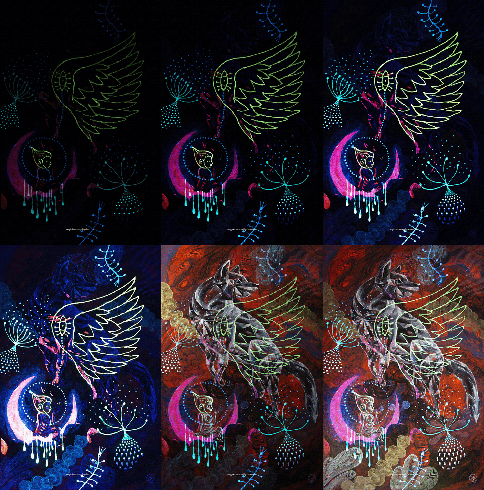
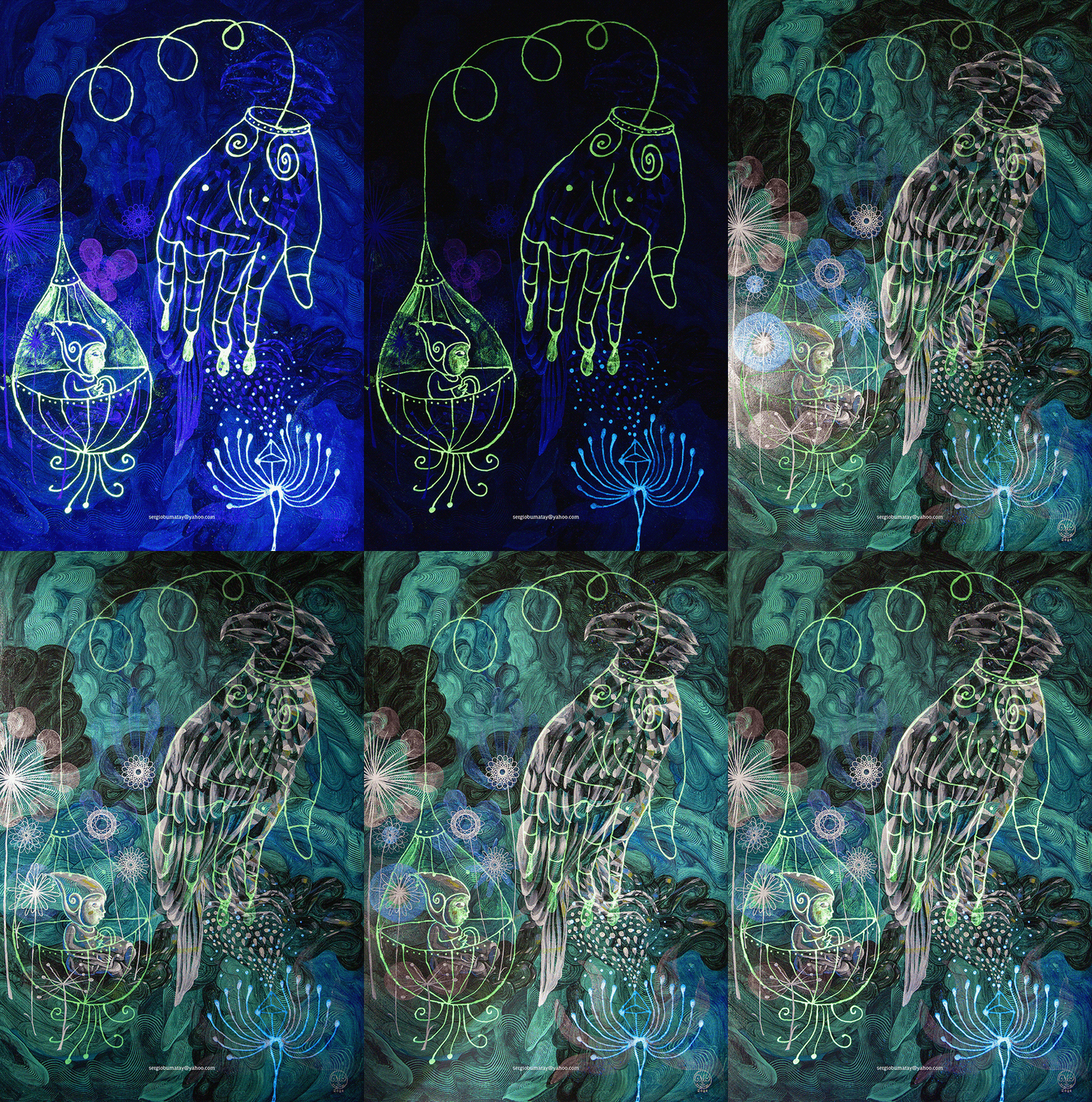
Refractions: my recent collection of painting in acrylic, phosphorescent paint (strontium aluminate, europium, dysprosium), reflective powder, iridescent paint, interference paint on canvas
sizes in 36”x 24” 
2020


crystal cricket finding refuge in magical garden

Glimmer


It's not a cockroach, it's a cricket!!! A lucky cricket.


crystal butterfly rising from a pond on magical garden


crystal cat looking above on magical garden


A painting or any art is a transfer of the artist's energy to their physical or maybe digital work. A token.


crystal wolf howling on magical garden


The effects of light on my works can be difficult to capture in one still image. A lot of details like reflected light and color is missing when I photograph them for documentation. 


majestic crystal lion on magical garden


On top of the complexity is the second image generated when it gets dark or UV (blacklight) is applied. 


crystal eagle resting on magical garden


Those complexities could push me to my next medium instead, perhaps diving into the digital realms?


Saturday, May 2, 2020

Art in a Time of Pandemic


Isolated, we turn to and create so much art, because it heals.


Seeing through the lens of a transplant, having the chance to look at how each unique worlds cope can be neutralizing in itself. The role of art (visual, music, or motion) changes greatly far beyond six feet apart, even wider when survival is at stake.  


On one side, art is the process, a medium–a channel. It's truly all about embracing the expression.


On the other end of the spectrum, it's the product, a commodity. It entertains, mostly.


Within the confines of quarantine, it's our only source of liberation.


Art during these times of crisis offers a discernible degree of brightness.


Here's art as a sedative:


***

Need some trendy mask?

rose petals mask trendy

I LOVE U highly recommended mask

Rabbit mask famous mask


Friday, January 24, 2020

How I view a Monet exhibit


A couple of firsts for me: first time to go to Denver Art Museum, a "world-class museum," and my first time seeing a collection of world-famous paintings by Claude Monet (#MonetatDAM). Having said that, I've set my expectations really very high, but also kept my emotions in check to balance my grip on reality.


We arrived early at the Denver Art Museum, a cool triangular building that reminded me of one of my favorite museums back home, the Ayala Museum.


My favorite Monet quote from the exhibit at the Denver Art Museum, just because it's DELICIOUS.

We showed our tickets, got in while the volunteers gave us some audio set for the infos. Once inside, everyone was like gasping in awe, murmuring everything positive. I was like, uhm ohkay, what am I missing?


That's him, Claude Monet himself by his lily ponds. 


Sunset at Lavacourt 1880 detail

What I'm curious about the exhibit, Claude Monet: The Truth of Nature, is how the brilliance of colors were preserved. I wonder if Monet's pigments were as bright as they originally were vs now that I've seen them in person, or were they enhanced by the conservators. The paintings looked as if freshly painted, no hints of oxidation or dulling, especially in the oranges of the sun above, and most of the pinks and blues. The whites also have this shimmering quality to it, close to pearlescent effect, or it must be the varnish that gives the paintings their unique brilliance. Perhaps mixing colors while preserving brilliance is Monet's genius, and the merit of the Impressionists.

I'd like to quote Leonardo da Vinci's observation on colors that seem to explain the brilliance of colors, as edited by Martin Kemp in his book, Leonardo on Painting: "...I remind myself that pink will also be increased in beauty when the sun which illuminates it turns reddish in the west, together with the clouds that intervene, although in this case it may be accepted as true that a pink illuminated by a rosy light displays beauty more here than elsewhere, which indicates that lights of other colours than red will take away its natural beauty ..."


My favorite painting from Monet's exhibit at the Denver Museum, because at first glance, you won't notice there's something going on in the fields.
The Meadow at Vetheuil 1879


You'll be delighted to discover those details later.
There's a story somewhere.


Another favorite because the geese are so happy. The Geese 1874


Water-lilies and Japanese Bridge 1899 


These Monet paintings (up and below) are, I believe, the two most popular as I've seen them used everywhere especially in art books. I was so eager to see these first because they're the lit paintings. I was anticipating these paintings fill the entire room, engulfing the viewer. I was expecting them to be as spectacular as Juan Luna's The Spoliarium. These pieces were placed near the end of the exhibit. Quite disappointed actually when I saw them finally, because they were not so big as I expected them to be! 


I found the exhibit very hyped up, as expected for many celebrated works. I also found the staging quite dated and too dark (I understand the drama they're evoking but it was so dark) for such a world-class level of a museum and body of works. How I would have made the staging better: added more play of lighting, simulating the gardens, the paintings as if they're windows of the outdoors; added interactivity and participation not just the usual multimedia. Plus, I would also consider children guest's eye level, not just in the audio narratives.

Maybe I was preempted by this more interesting exhibit next door:
Treasures of British Art: The Berger Collection

This exhibit is more fabulous because, FASHION!
Mr. Berger really knows how to collect the jewels.


Portrait of a Lady, early 1600s, by "Follower of William Larkin" 

 Three Young Girls, early 1600s, by a British artist. (of course!)

Detail of Elizabeth Poulett painting, 1616, by "Follower of Robert Peake"

Detail of Portrait of a Young Lady, about 1620, by Paul van Somer


The beauty is all in the details and probably in their back stories.