Monday, January 27, 2020

How to mask paint with rubber cement


How to mask paint with rubber cement (cheaper alternative to watercolor masking fluid) and acrylic


If you like a step by step, at your own pace tutorial:


I’m using again a kraft cardboard as my canvas. 
First, I lightly draw the elements using a white charcoal. It’s easier to erase and see the outlines with white lines over the kraft paper.
The elements or shapes should be simple with less details. 
Don’t be afraid to make mistakes. You’ll create accidental textures which is great.


Using a fine brush, dip it in just the right amount of rubber cement.
Close the lid immediately after dipping so it won't dry out easily.
Brush the rubber cement to fill the elements you want to mask.
Try to paint as fast as you can because the rubber cement dries fast and becomes too sticky.
You don't have to be perfect.


If the paint has dried, you can wipe the brush with tissue or wet cloth to remove the sticky residue.
Close the lid of the rubber cement as much as you can so it won't dry and stay spreadable. Yeah, like a jam!
I'm using a brush for acrylic, it's firm yet kind of soft while painting with rubber cement.
You can control the acrylic brush once the rubber cement becomes gluey.
You can add in and paint additional details, just remember where are those located. So you'll know where to remove the mask later.
Random shapes or patterns really works best so you don't have to be ultramegaboom detailed with it.
Besides, rubber cement is good for random patterns and textures. 
Rubber cement is not good for detailed paintings or illustrations, ohkay. 
Rubber cement is good for creating lots of yummy textures in your paintings or illustrations.
The one you are painting with rubber cement is the one you don't want to paint over with, or "masking"
Masking works great when you want your canvas or paper as foreground.
You can paint the masked part later, but the effect of masking won't be noticeable.


After the rubber cement has thoroughly dried, you can then paint it over with as usual.


I'm using acrylic here, making note of the masked edges.


Once your paint has dried, the fun part begins! 
Now you can erase the rubber cement with rubber eraser.
Be gentle when erasing, especially if you painted with acrylic and the paint is very thick.


I tried different kinds of rubber eraser such as kneaded and red pencil eraser, but the white firm ones work best.


I had a hard time erasing because the acrylic paint was thick, I had to scrape and help some to get it out.
Clean gently the leftovers with a dry brush.
If you use watercolor, it will probably be easier to erase the rubber cement mask.


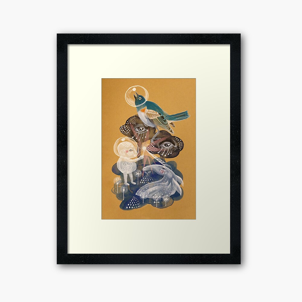
I'm done with the masking part so I've added details for this picture book illustration.


I love painting white glass houses!


Adding some more details with disguising water lilies!


DONE! Enjoy! I hope you like this video!

Check out my shop at stbiii0.redbubble.com too!

If you like this tutorial, please leave a comment!


Friday, January 24, 2020

How I view a Monet exhibit


A couple of firsts for me: first time to go to Denver Art Museum, a "world-class museum," and my first time seeing a collection of world-famous paintings by Claude Monet (#MonetatDAM). Having said that, I've set my expectations really very high, but also kept my emotions in check to balance my grip on reality.


We arrived early at the Denver Art Museum, a cool triangular building that reminded me of one of my favorite museums back home, the Ayala Museum.


My favorite Monet quote from the exhibit at the Denver Art Museum, just because it's DELICIOUS.

We showed our tickets, got in while the volunteers gave us some audio set for the infos. Once inside, everyone was like gasping in awe, murmuring everything positive. I was like, uhm ohkay, what am I missing?


That's him, Claude Monet himself by his lily ponds. 


Sunset at Lavacourt 1880 detail

What I'm curious about the exhibit, Claude Monet: The Truth of Nature, is how the brilliance of colors were preserved. I wonder if Monet's pigments were as bright as they originally were vs now that I've seen them in person, or were they enhanced by the conservators. The paintings looked as if freshly painted, no hints of oxidation or dulling, especially in the oranges of the sun above, and most of the pinks and blues. The whites also have this shimmering quality to it, close to pearlescent effect, or it must be the varnish that gives the paintings their unique brilliance. Perhaps mixing colors while preserving brilliance is Monet's genius, and the merit of the Impressionists.

I'd like to quote Leonardo da Vinci's observation on colors that seem to explain the brilliance of colors, as edited by Martin Kemp in his book, Leonardo on Painting: "...I remind myself that pink will also be increased in beauty when the sun which illuminates it turns reddish in the west, together with the clouds that intervene, although in this case it may be accepted as true that a pink illuminated by a rosy light displays beauty more here than elsewhere, which indicates that lights of other colours than red will take away its natural beauty ..."


My favorite painting from Monet's exhibit at the Denver Museum, because at first glance, you won't notice there's something going on in the fields.
The Meadow at Vetheuil 1879


You'll be delighted to discover those details later.
There's a story somewhere.


Another favorite because the geese are so happy. The Geese 1874


Water-lilies and Japanese Bridge 1899 


These Monet paintings (up and below) are, I believe, the two most popular as I've seen them used everywhere especially in art books. I was so eager to see these first because they're the lit paintings. I was anticipating these paintings fill the entire room, engulfing the viewer. I was expecting them to be as spectacular as Juan Luna's The Spoliarium. These pieces were placed near the end of the exhibit. Quite disappointed actually when I saw them finally, because they were not so big as I expected them to be! 


I found the exhibit very hyped up, as expected for many celebrated works. I also found the staging quite dated and too dark (I understand the drama they're evoking but it was so dark) for such a world-class level of a museum and body of works. How I would have made the staging better: added more play of lighting, simulating the gardens, the paintings as if they're windows of the outdoors; added interactivity and participation not just the usual multimedia. Plus, I would also consider children guest's eye level, not just in the audio narratives.

Maybe I was preempted by this more interesting exhibit next door:
Treasures of British Art: The Berger Collection

This exhibit is more fabulous because, FASHION!
Mr. Berger really knows how to collect the jewels.


Portrait of a Lady, early 1600s, by "Follower of William Larkin" 

 Three Young Girls, early 1600s, by a British artist. (of course!)

Detail of Elizabeth Poulett painting, 1616, by "Follower of Robert Peake"

Detail of Portrait of a Young Lady, about 1620, by Paul van Somer


The beauty is all in the details and probably in their back stories.


Monday, January 13, 2020

How to paint on Kraft notebook


I really love the texture of Kraft paper or corrugated cardboard. We see Kraft paper or cardboard everywhere and use it on everything. Kraft paper and cardboard is so ordinary and yet it gives a feeling that it’s a very useful and versatile material.


In this video, I found a kraft notebook in a thrift store and just wanted to paint over with a fantasy or magical scene. I love this notebook, it looks like the Kraft notebook that Muji have. Although the ones that Muji sells are so expensive! The design of this Kraft notebook is so simple yet so elegant, even the paper inside is yummy. The inside paper is cream and so smooth, so delicious.


Sharing the Light art inspiration video using acrylic, acrylic gouache, watercolor, pen, pencil on Kraft paper notebook


Going back to this art inspiration video, I start off with a random acrylic gouache buildup below just to create some textures. I use my signature blue palette. I also add some figurative blobs as well to add some elements that I will place more details later, after I figure out what to create with the form.


Sharing the Light scarf karf


I continue to add forms with acrylic using other color palettes and figure out later what will it be. I guess I want to paint a magical scene for this. Maybe a fantastical character hiding in the forest doing some magic? A unicorn sharing some power to this fantasy character, or a person who needs some “power” or light?


I decided to create a fantasy scene. So I transformed the two watercolor blob elements into human-like or anthropomorphic trees and added eyes. No, they’re not evil and occult! They’re on side view, haha! Besides they have a heart highlight! These trees are the guardians of the forest, the eyes symbolize the spirit that they embody.


Sharing the Light curtains, covers, and more


Of course, I love drawing and painting birds, so I’ve added a blue bird as well. I painted the blue bird on unusual scale just to give it a magical vibe visually. I usually use the works of John James Audubon’s illustrations of American birds as reference. I admire Audubon’s paintings of birds so much because it is so detailed and he created the illustrations from life, meaning he was there with the birds while he’s drawing or painting! What an extraordinary way of living as an artist and illustrator!


So, I finished the painting by dabbing some reflective paint on some elements such as the wand of light and the horn of the unicorn. I really love anything shiny or glittery, reflective things, it just makes any surrounding bright and energizing using only the play of light. Shiny things have personal meaning to me too.


Get some Light then Share it! 


That’s it!  I hope you enjoy watching! If you like my video, please subscribe and leave a comment. If you have topics or characters that you want me to draw, leave me a comment as well!

Love the Sharing the Light art inspiration video? You'll also love these designs too!


Sharing the Light tee that makes you go weee!


How about some hugs on Sharing the Light floor pillow?